Branding and support for financial tech
Facilitating the financial advisor-client relationship
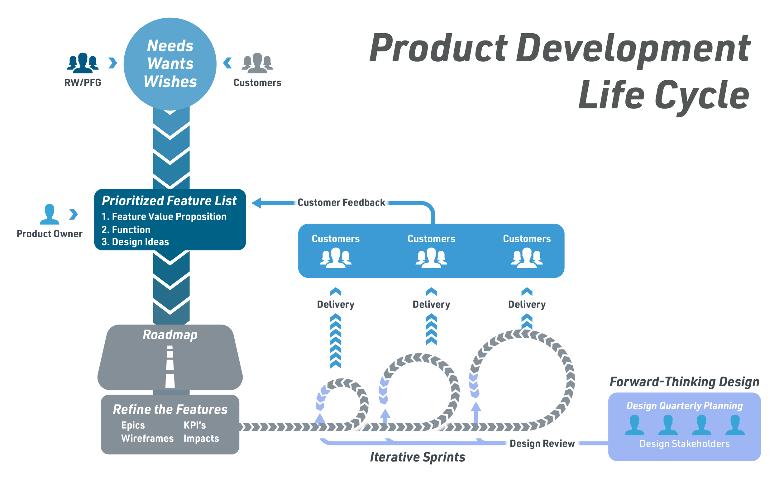
The relationship financial advisors have with their clients has been a historically hands on task. There were few tools that allowed the client to have easy access to viewing the status of their investments, and were often left checking in with their advisors to get reports back. That’s where RobustWealth steps in. By curating a white-labeled SAAS platform with both Advisor and Client portals, advisors were able to focus more on helping their clients’ wealth grow, and clients were able to track that growth in real time.
During my time with the company I operated as a product designer with a focus on managing the user experience and interface of the client platform, as well as championing updated branding and supporting the marketing team across a variety of channels and events.
RE-establishing our presence
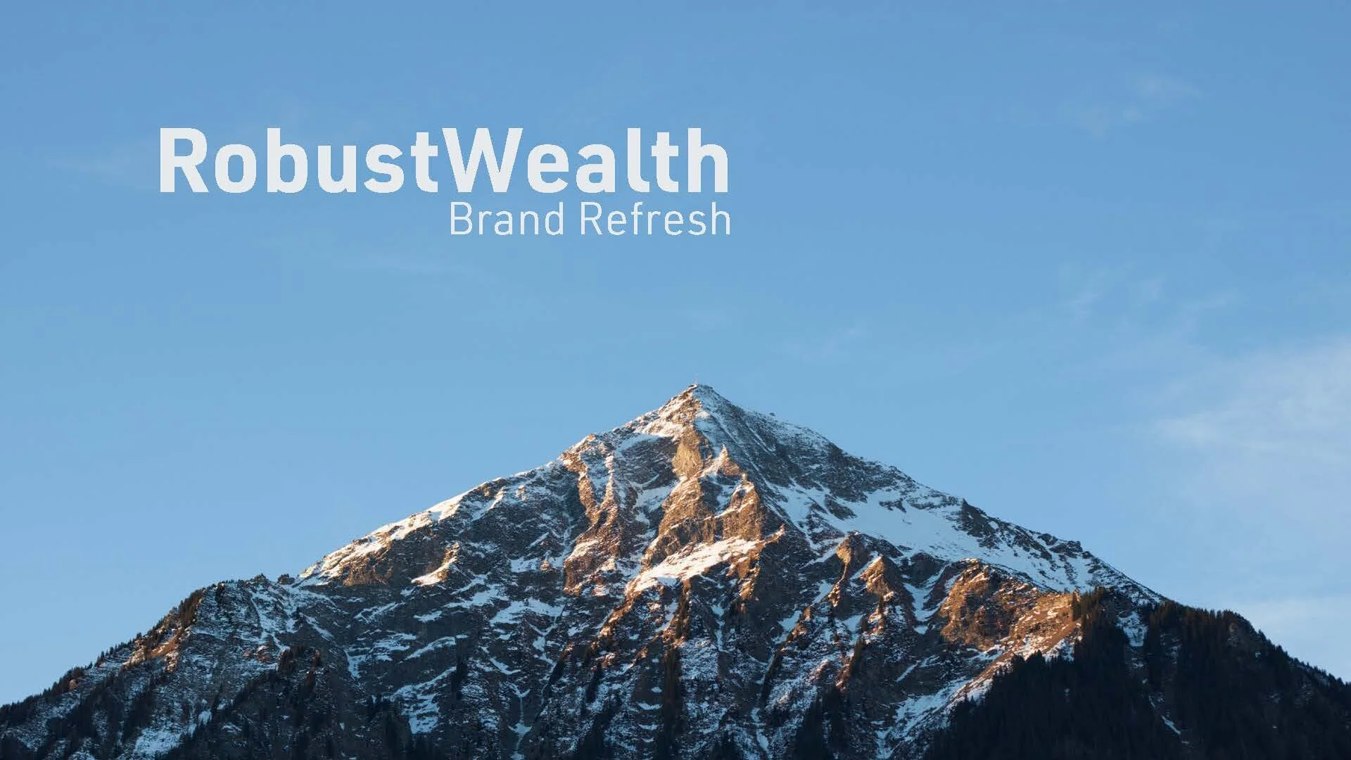
When I first started at RobustWealth I was tasked with updating our brand and solving some key challenges. The CEO was a dedicated outdoorsman and required we utilize a mountain in our execution. Before I joined the team and took over this project the icon was developed, and it was my job to take this over the finish line.
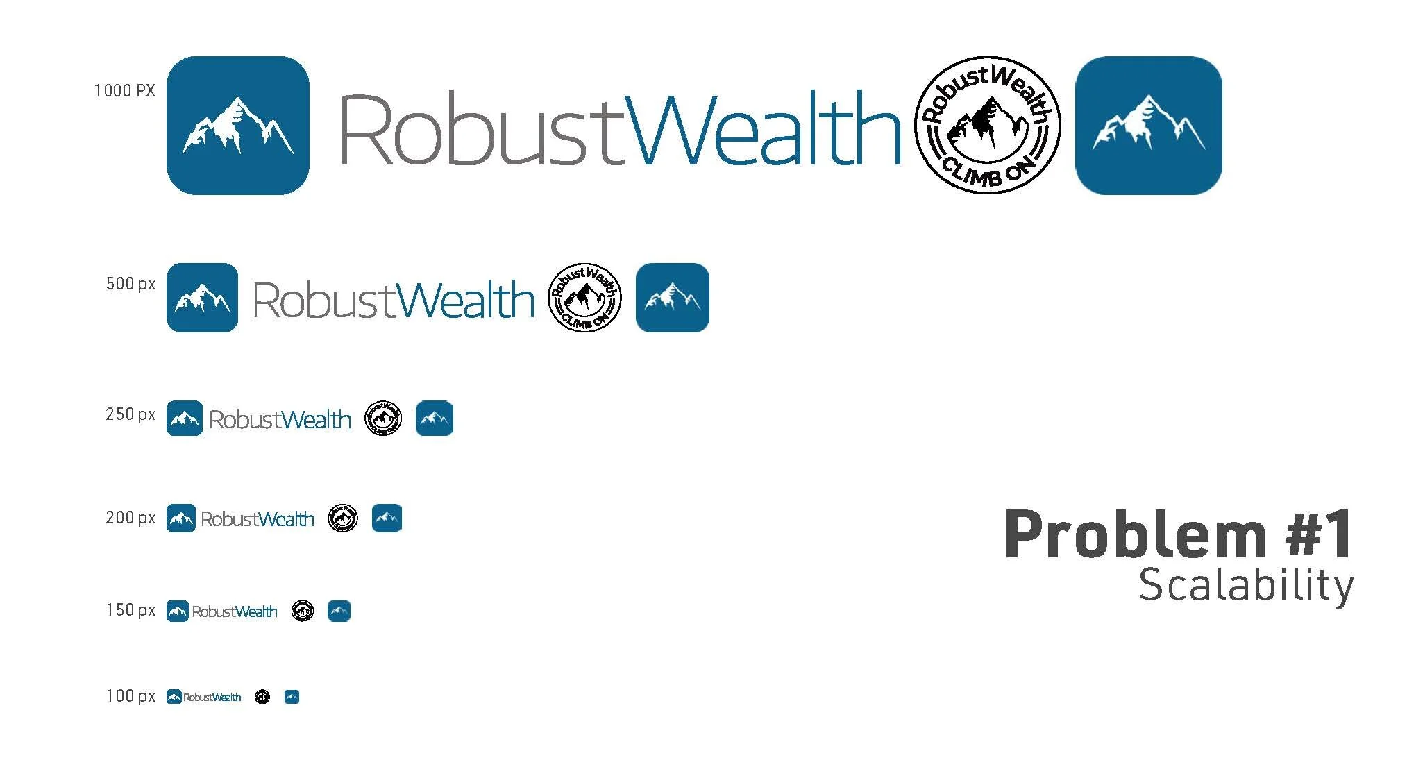
I began by analyzing what we had done before, and identifying some of the issues with the previous logos the company utilized. I identified four major areas for improvement.
Scalability - The logos in use when I started didn’t work well at smaller scales. They were too light to read well quickly
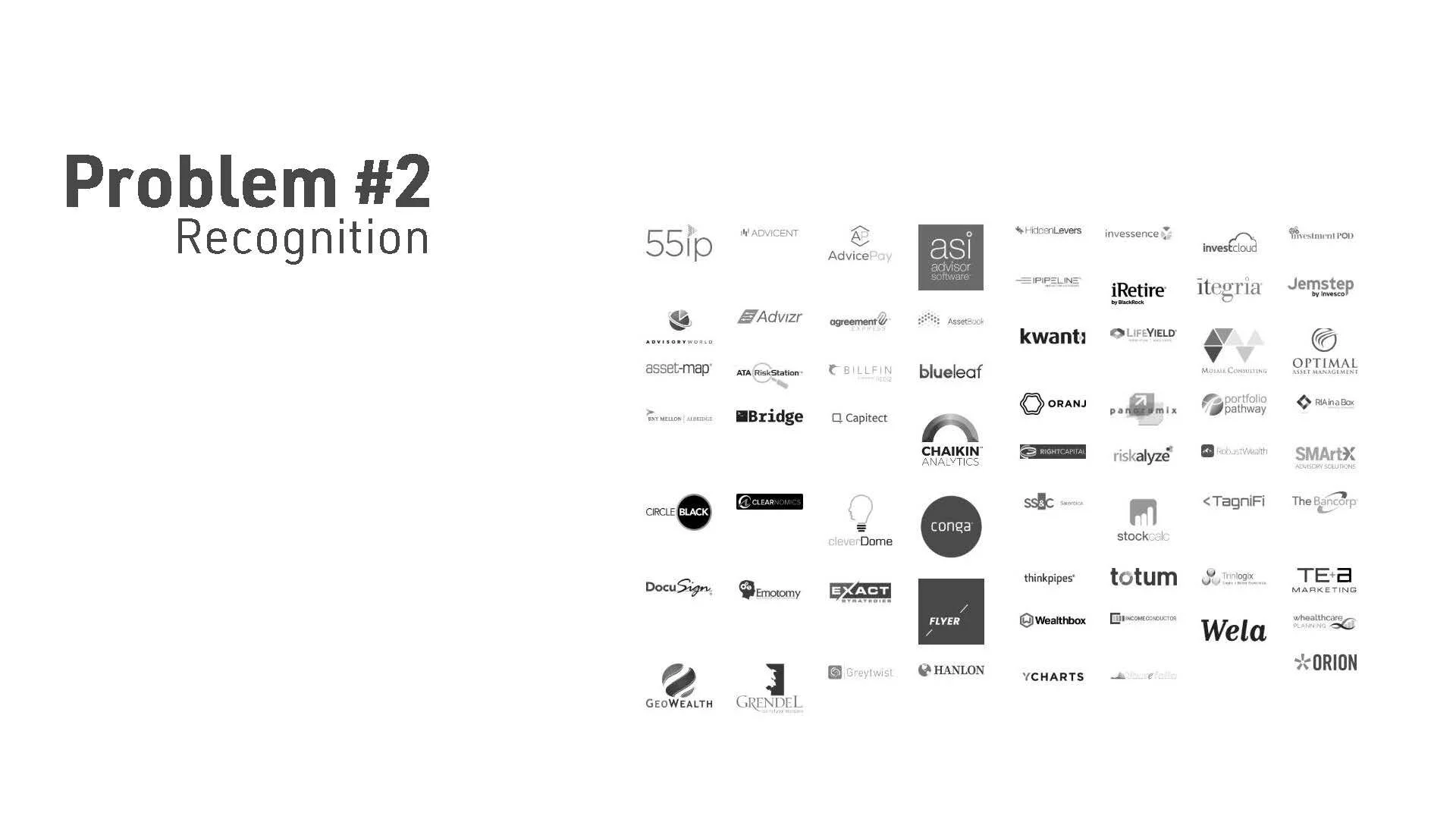
Rcognition - In a rapidly growing industry where you’re constantly fighting to be at the table, having a mark that blends in with the rest of the field won’t get you a seat.
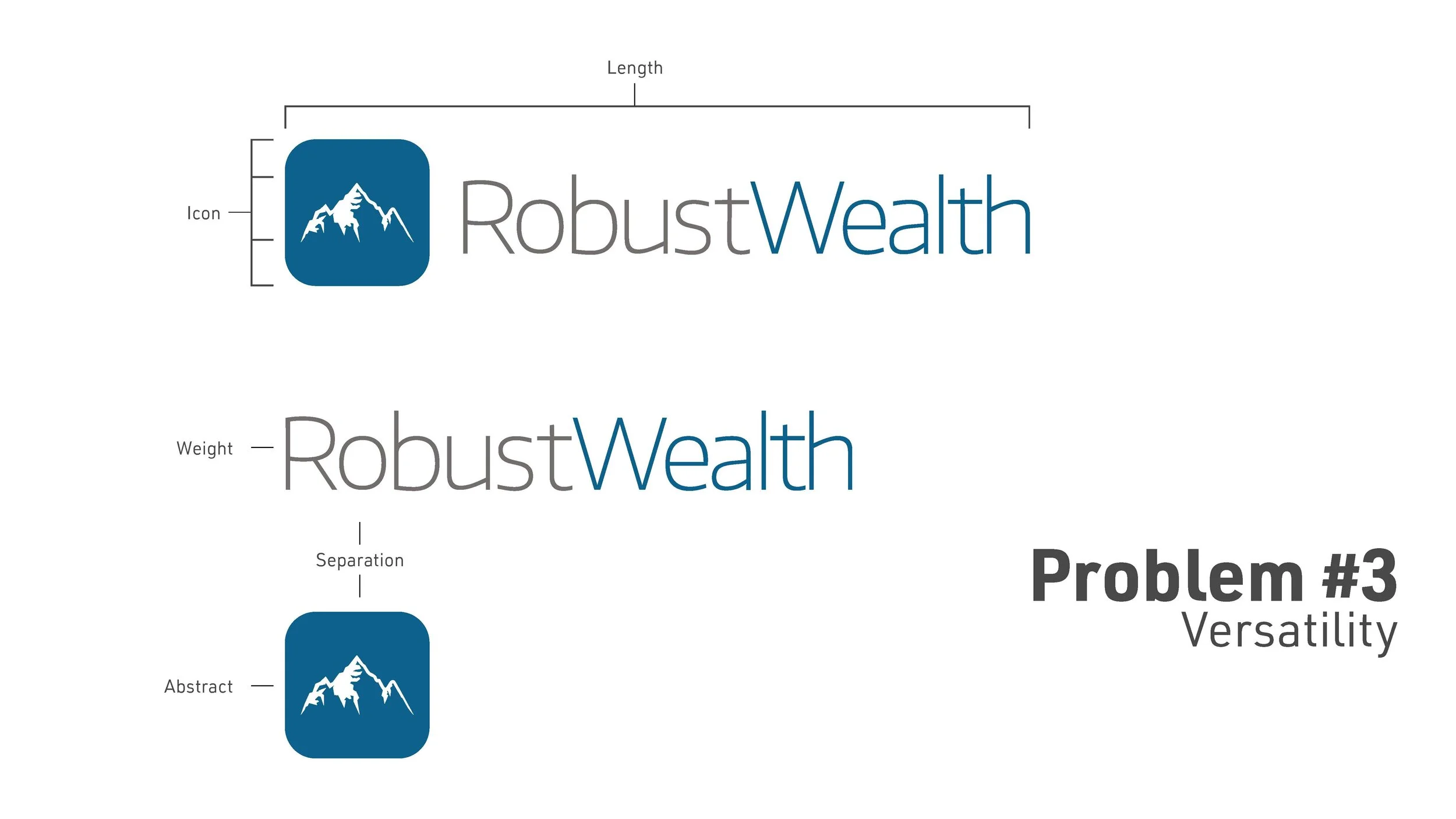
Verastility - The light text weight wasn’t serving the values of the company and leaned more healthcare than fintech, and when the icon was separated from the wordmark all recognition was gone.
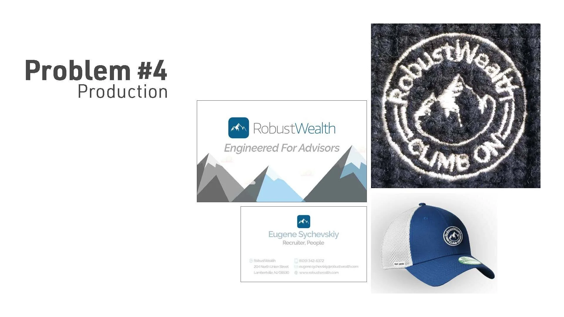
Production - The light weight of the wordmark lent itself to quickly becoming muddied when produced anywhere besides traditional print or digital spaces.
Identifying these weak point helped me establish my goals for the final mark. The solution I came to needed to be VERSATILE, SCALABLE, AND BOLD.
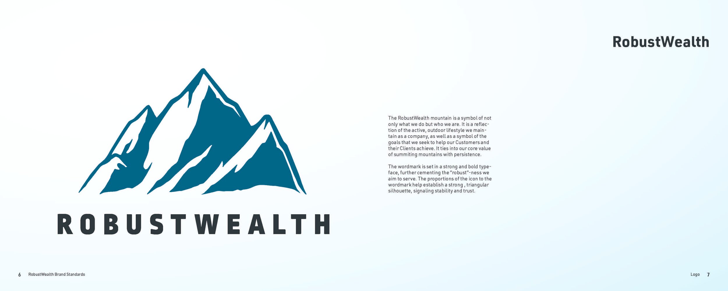
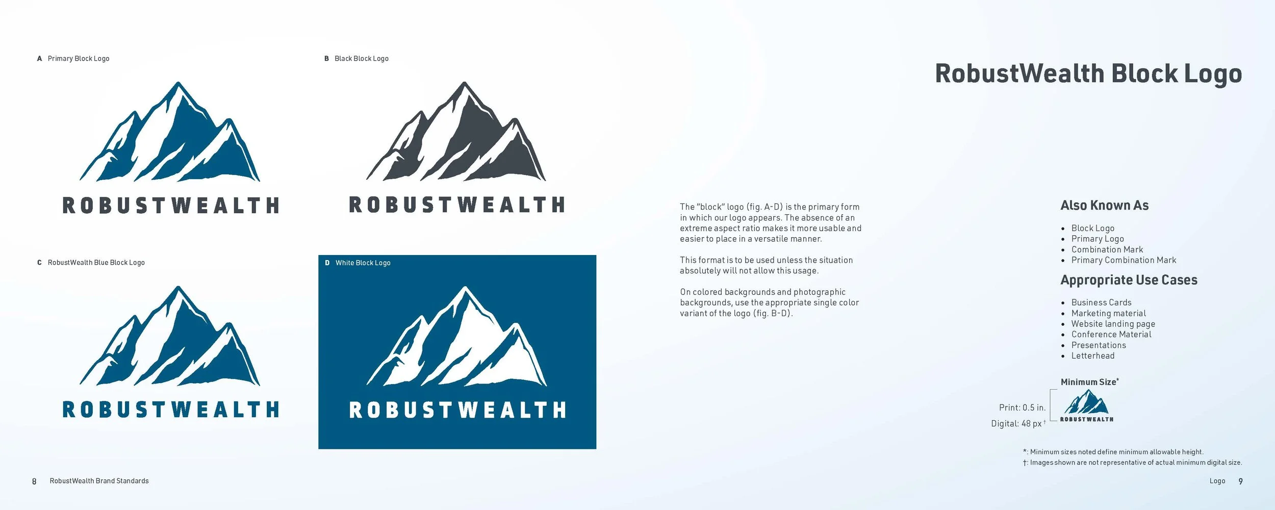
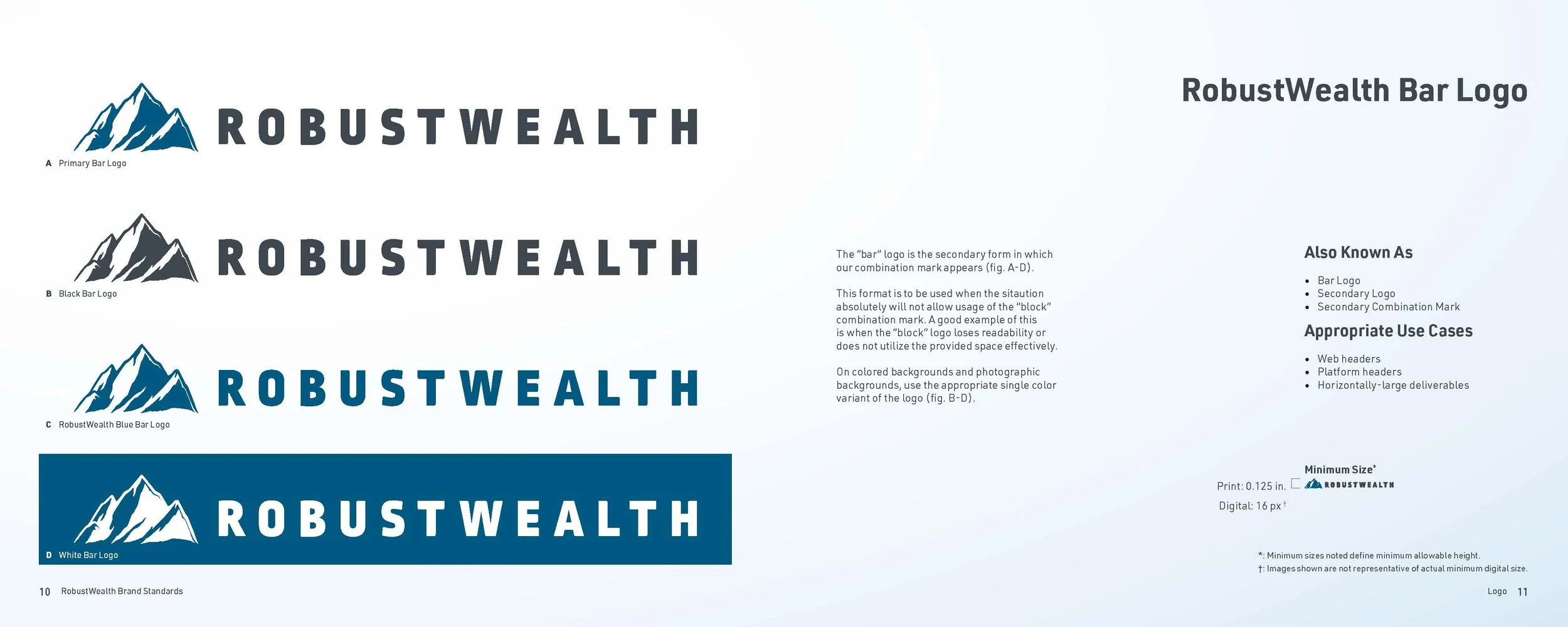
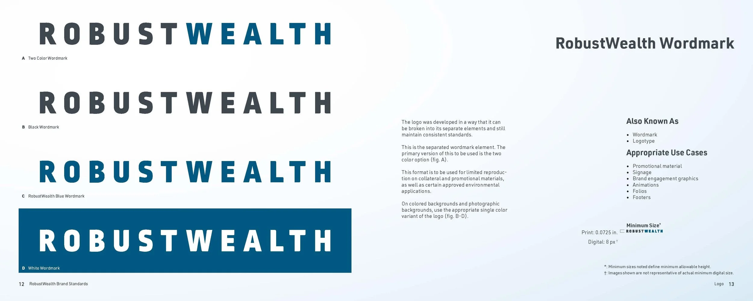
The solution I came to was a strong geometric wordmark that is tracked out a bit. It was the best solution to pair with the provided and required use mountain icon, as it compliment and grounds the piece well without taking the spotlight. By increasing the tracking I was able to ensure better readability at smaller scales, and the system developed alongside the final mark proved flexible and able to handle the mark in a variety of use cases. One constraint of the project is that “RobustWealth” is always used as one word and therefore could not be separated into two lines.
If I could go back and re-work this piece, I’d push re-visit the mountain icon. The one shown was a constraint of the project as money had been spent with a contractor to develop it, so it needed to be included and highlighted. As it stood it feels very close to the Prudential icon and need to be better distinguished. The horizontal lockup also gets cumbersome in certain use cases. Given another opportunity to tackle this I’d have selected or developed an even more condensed logotype.
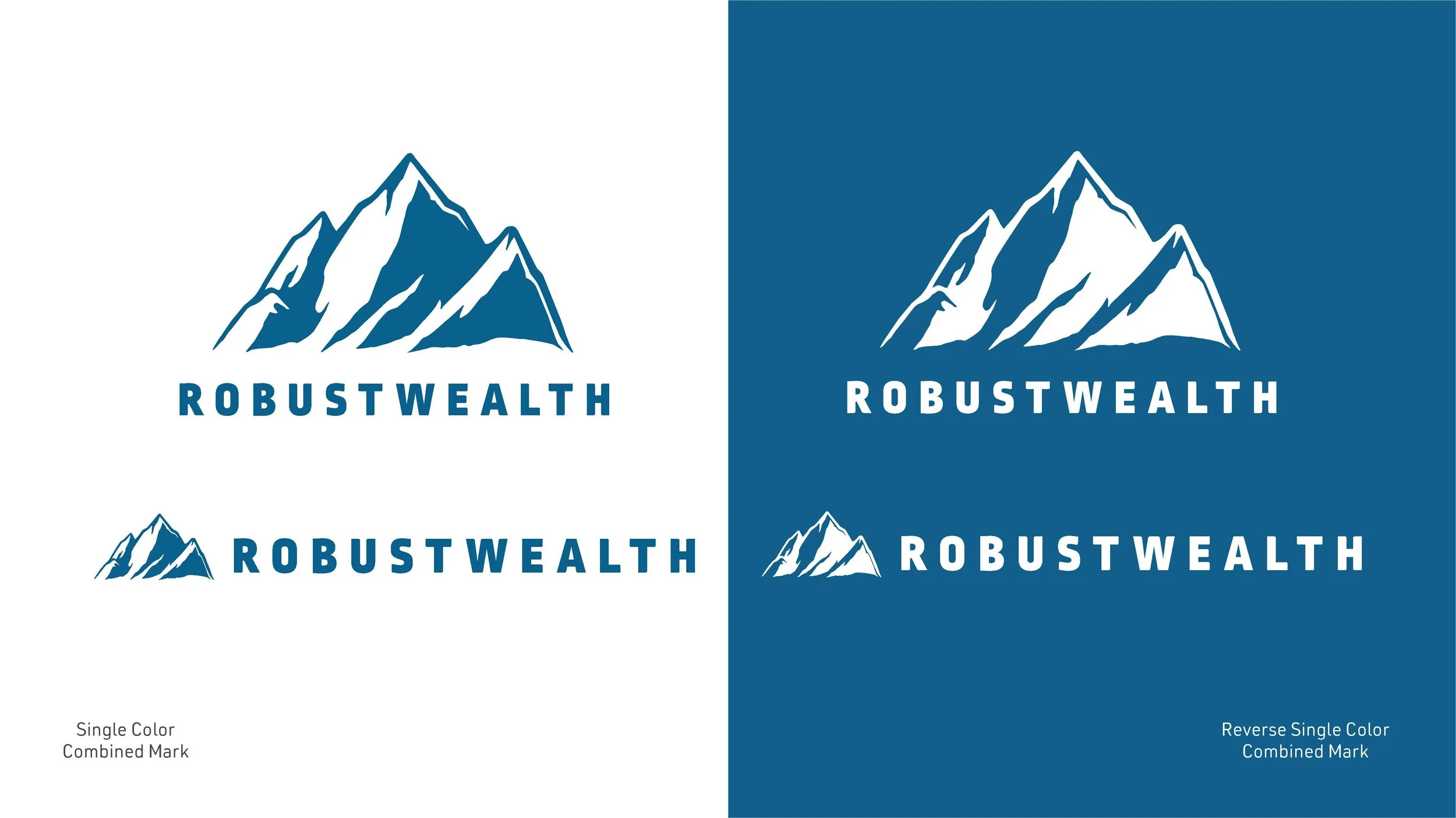
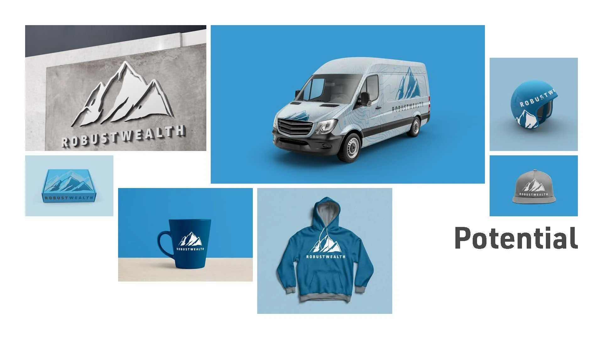
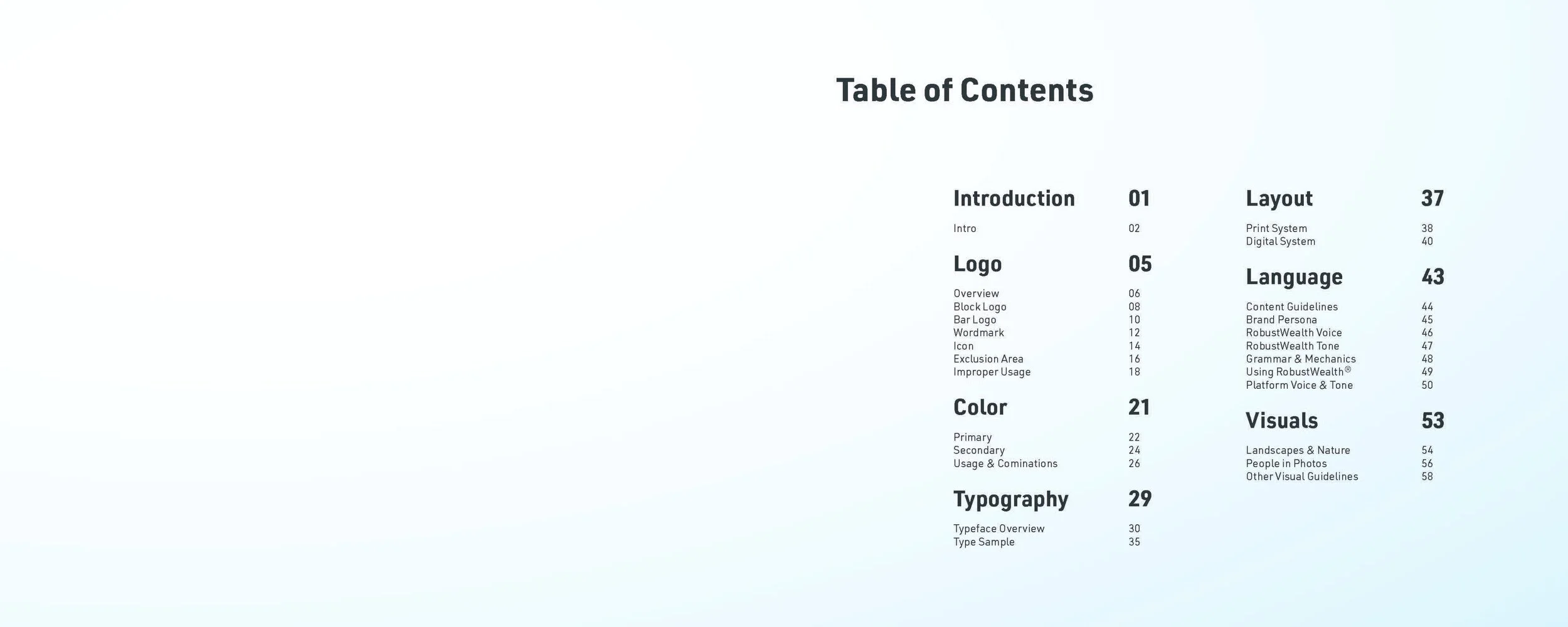
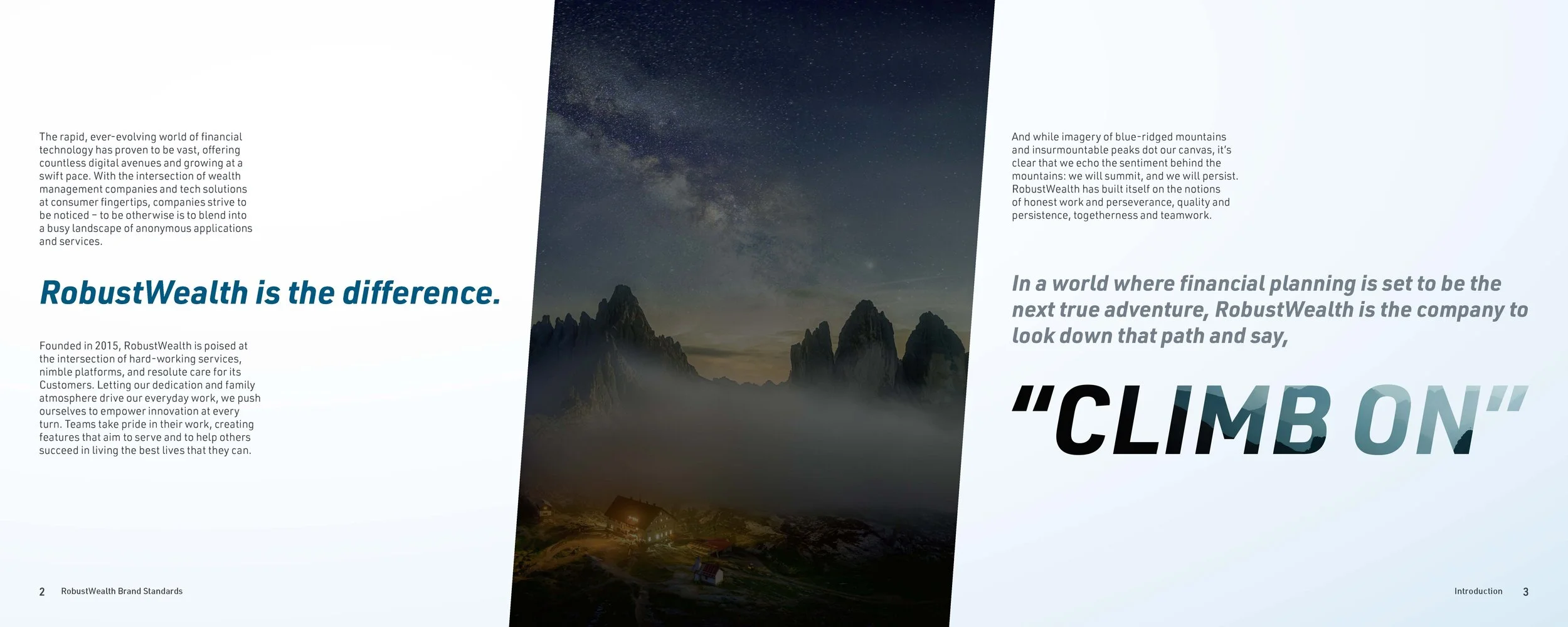
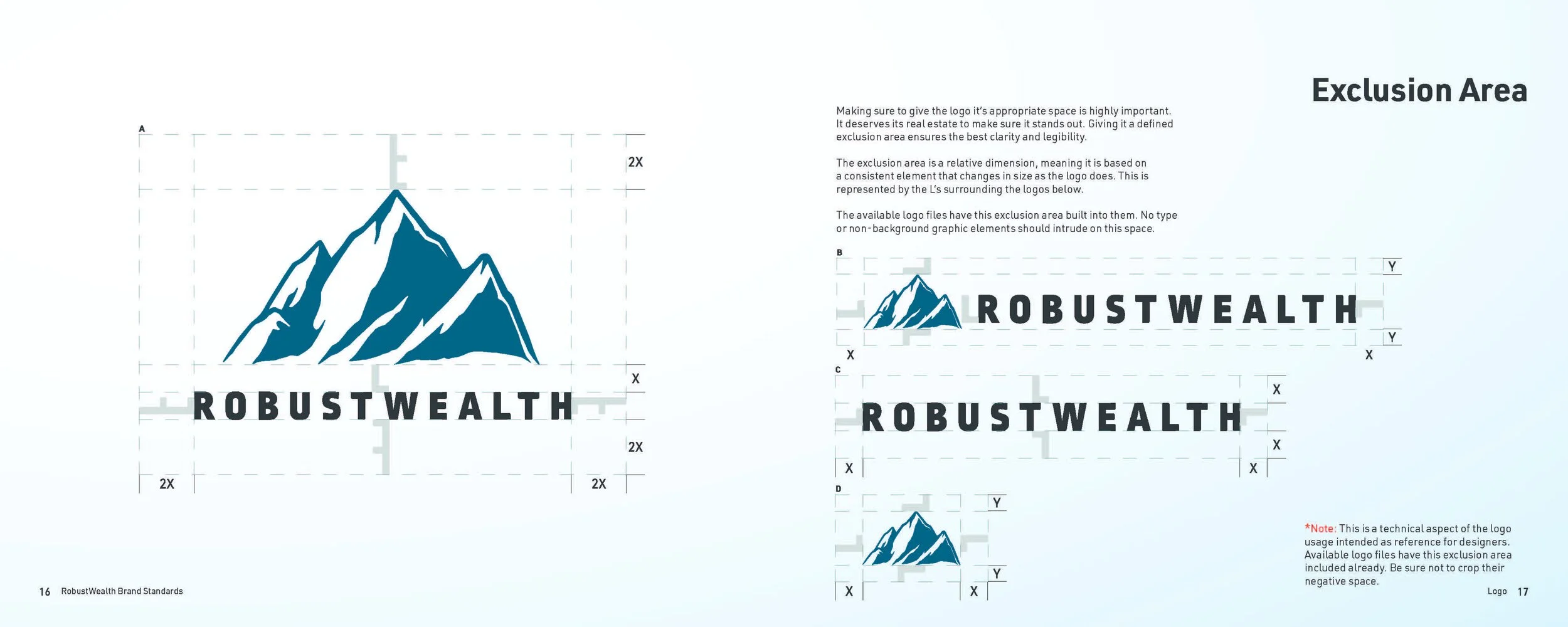
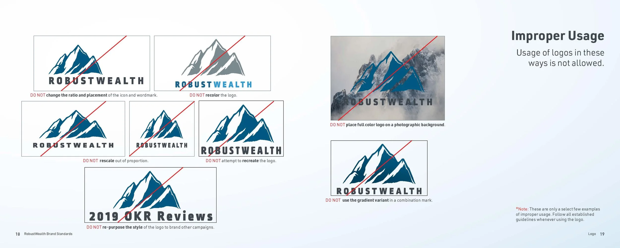
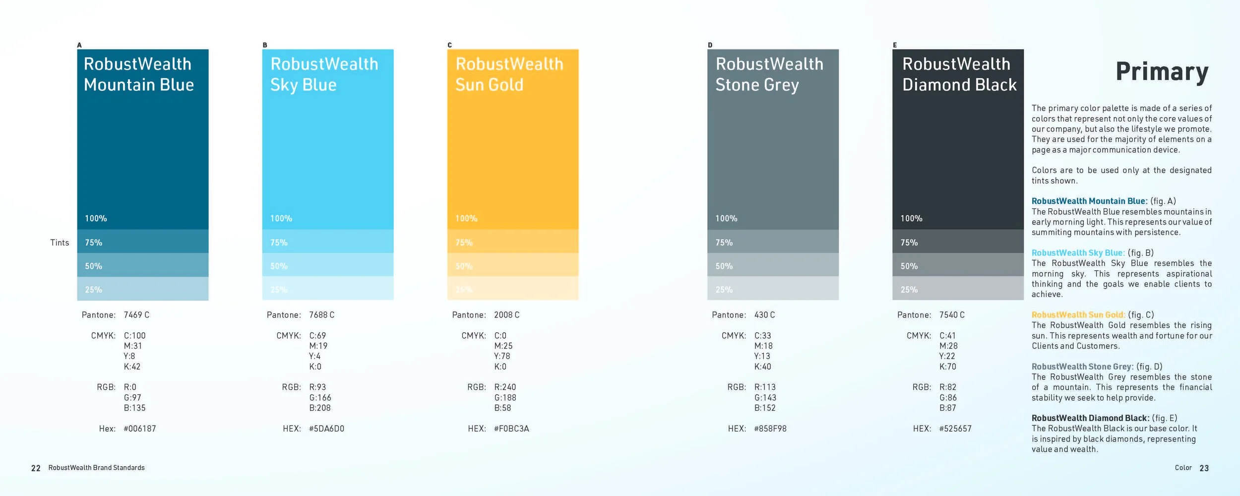
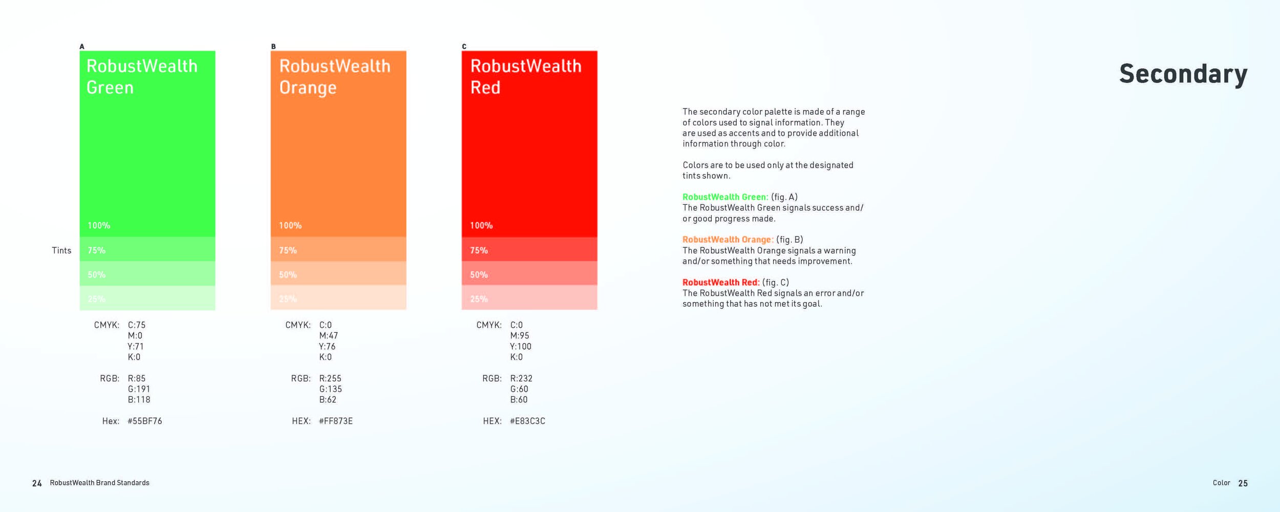
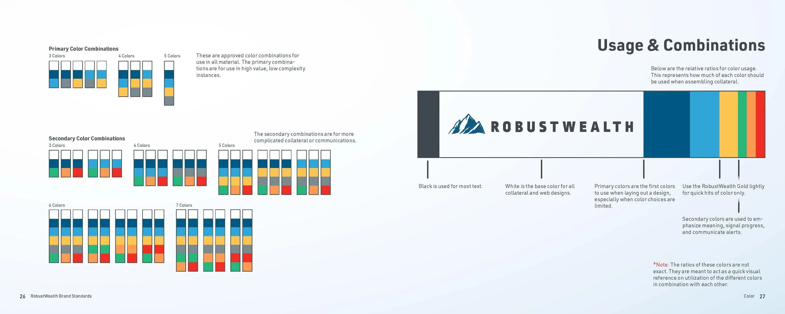
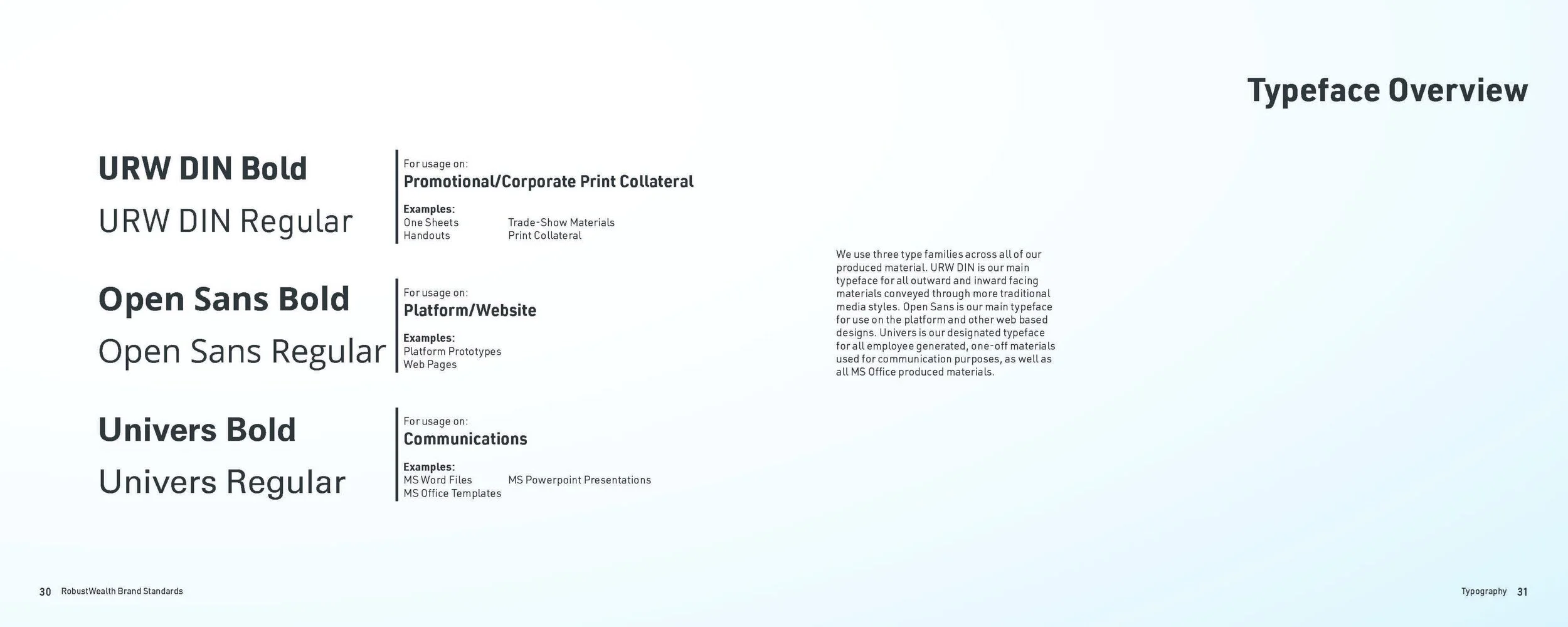
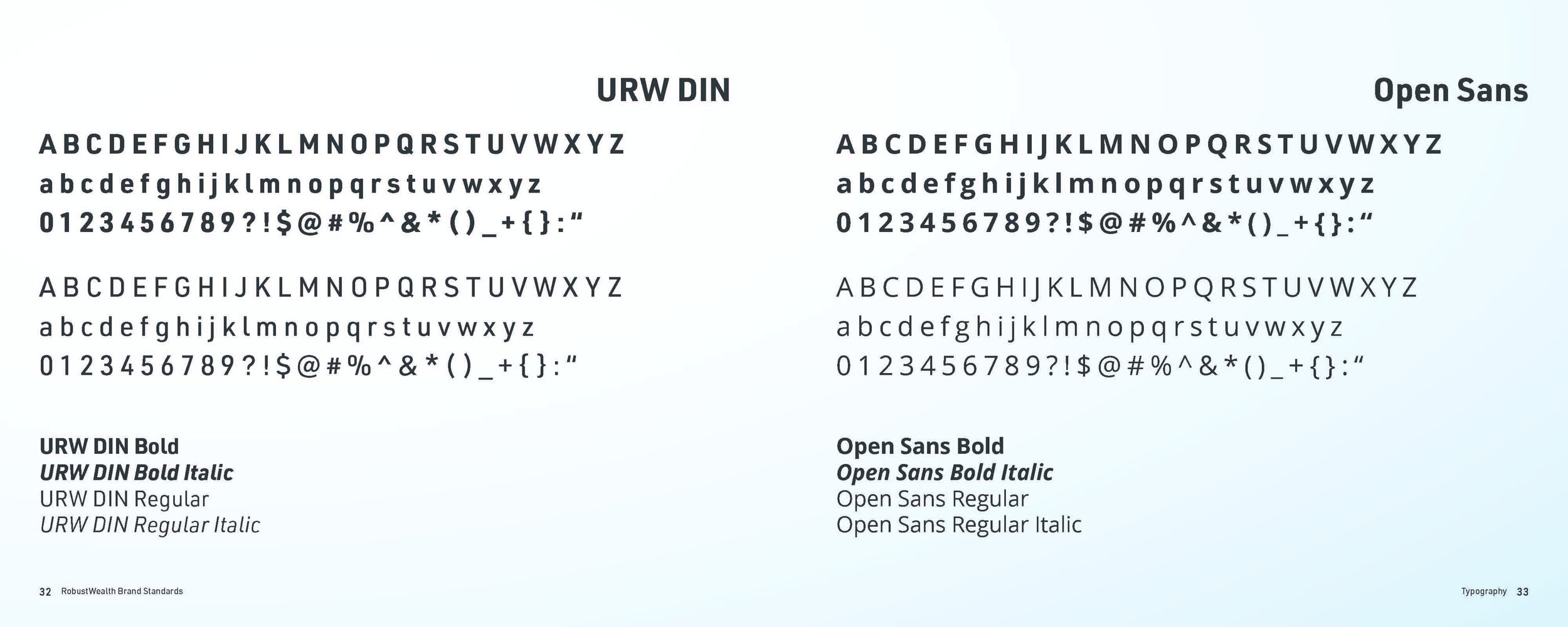
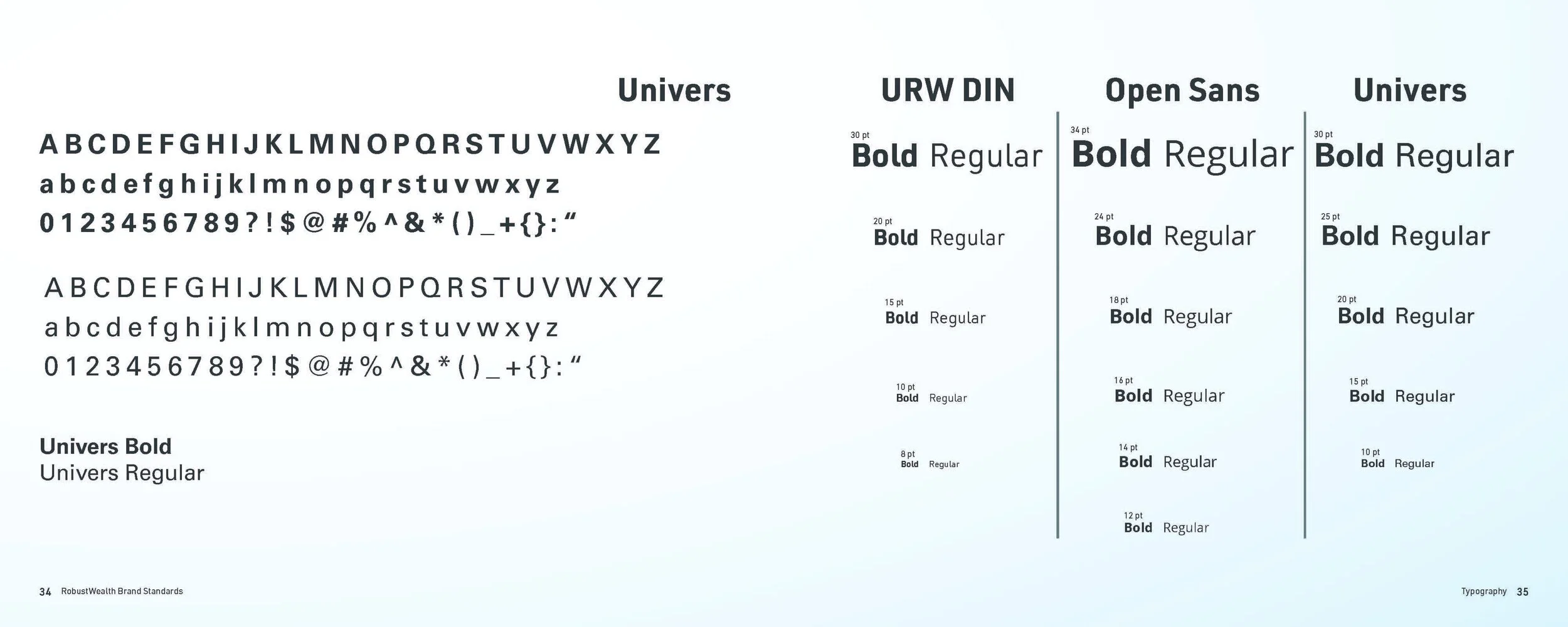
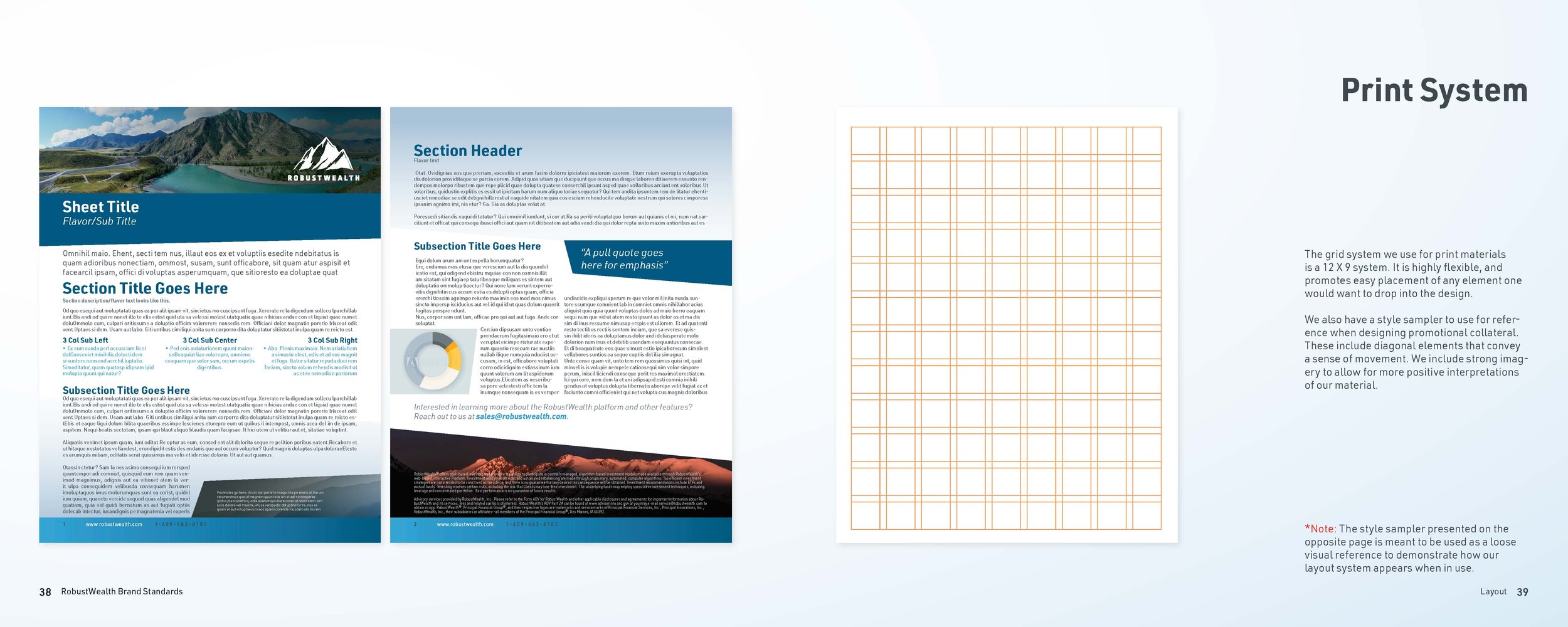
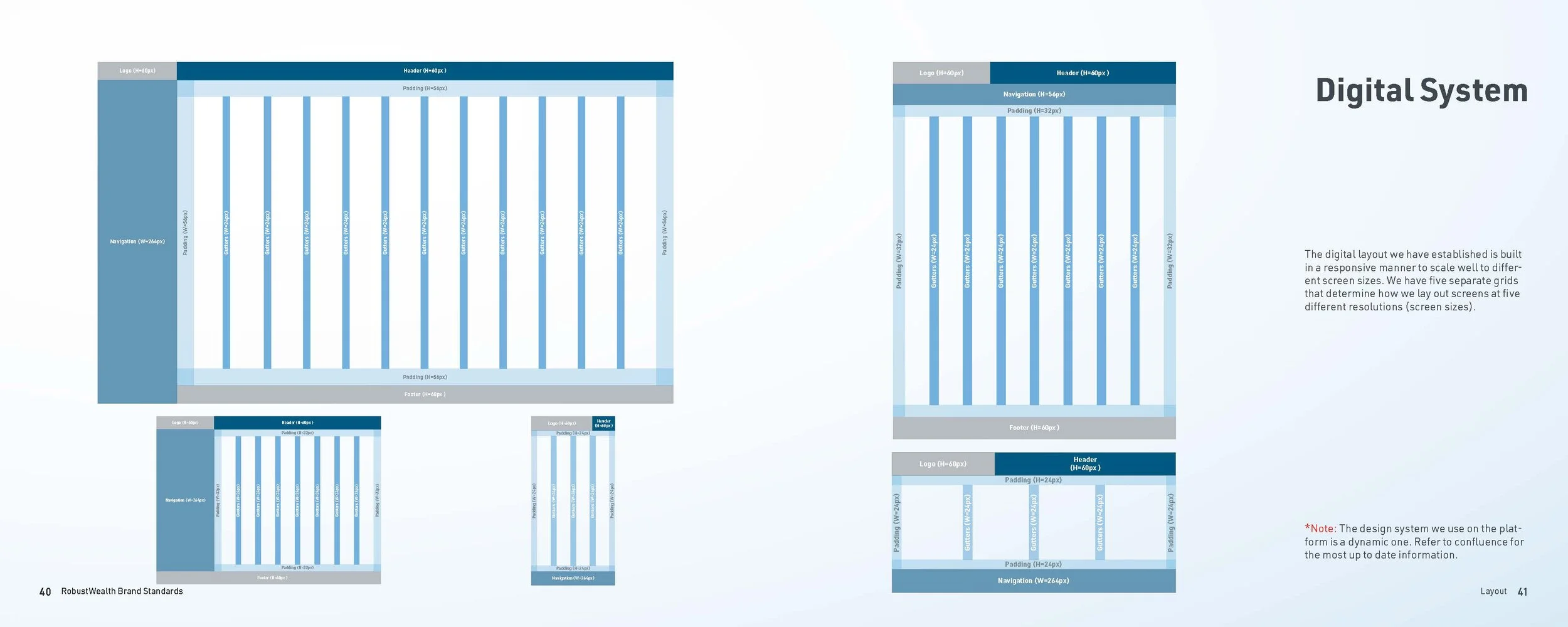
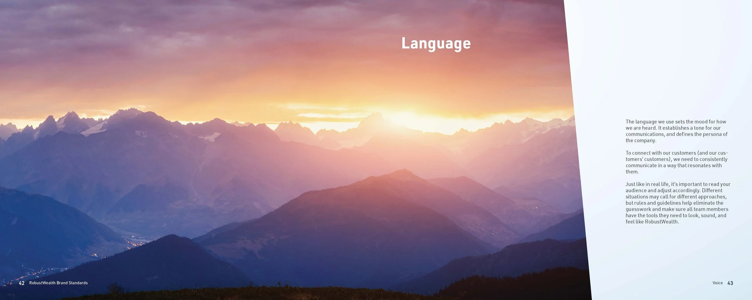
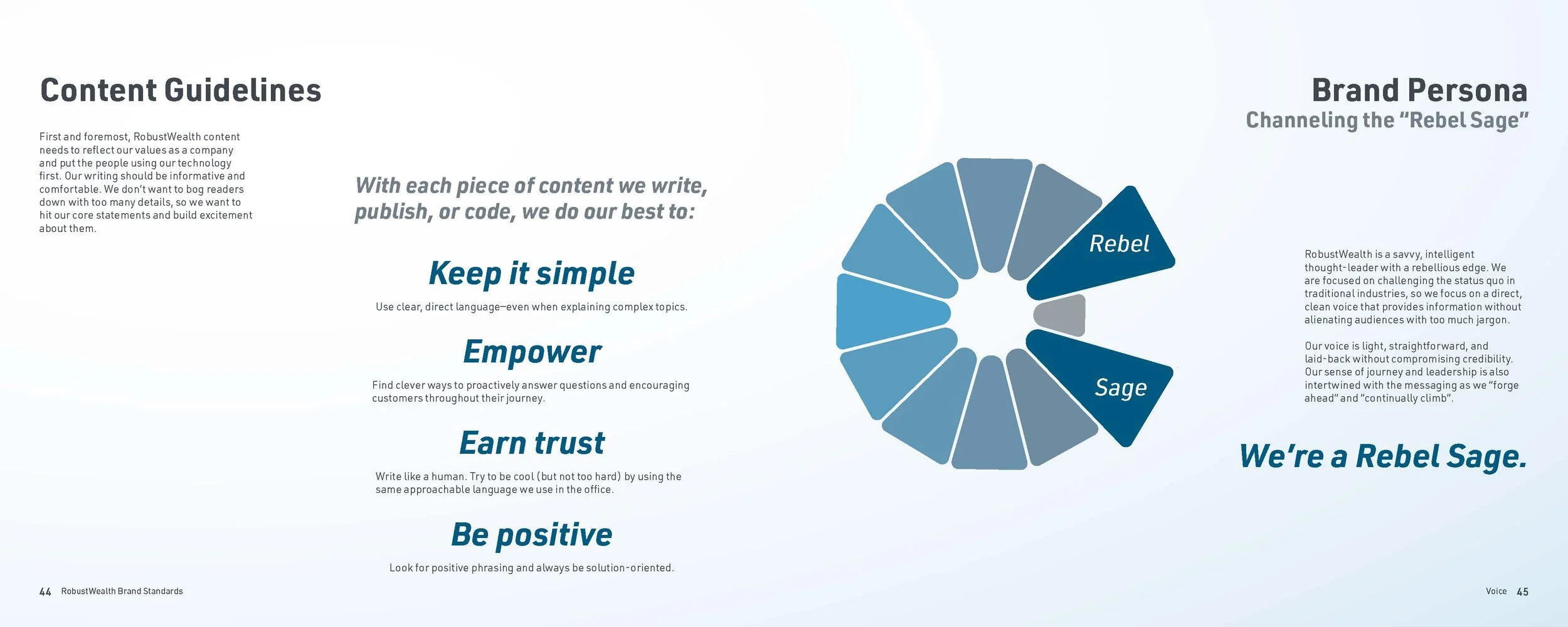
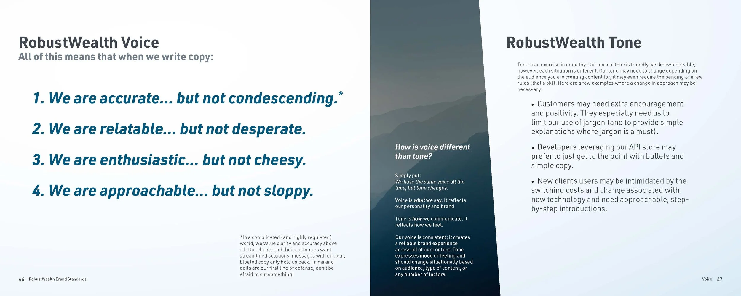
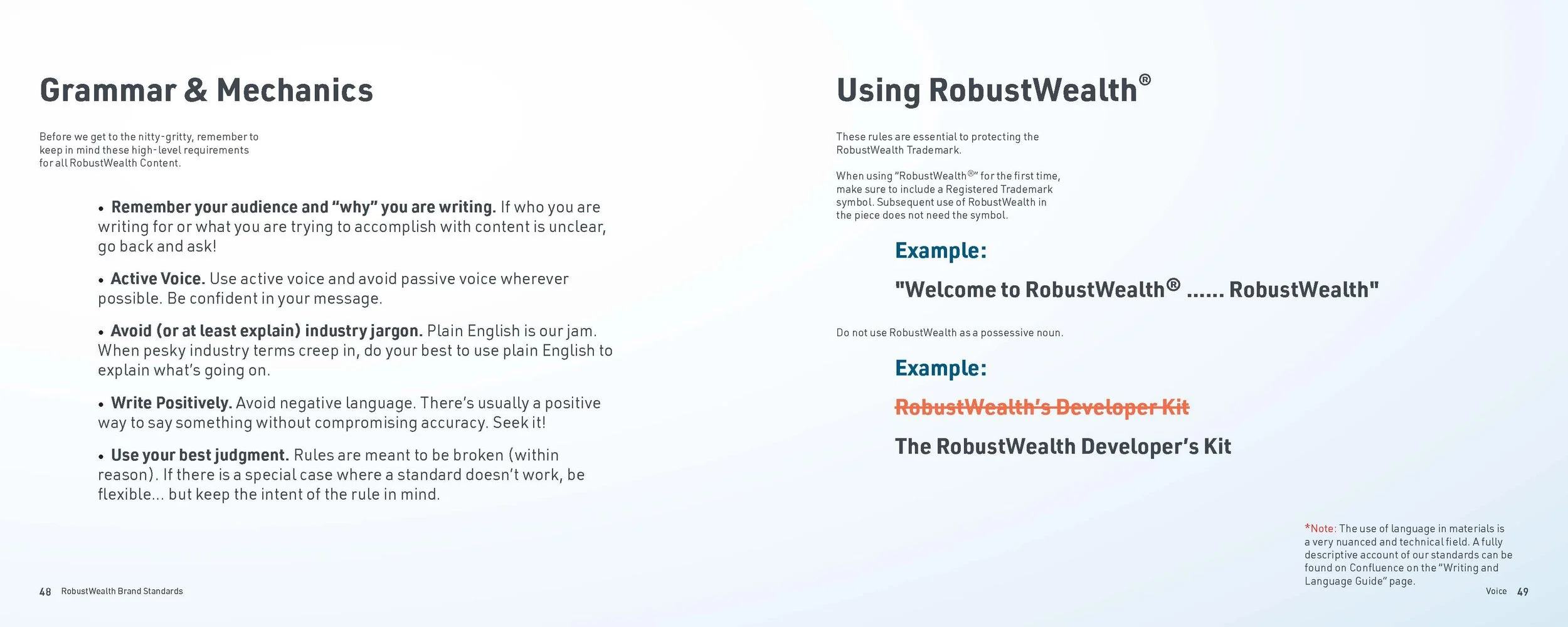
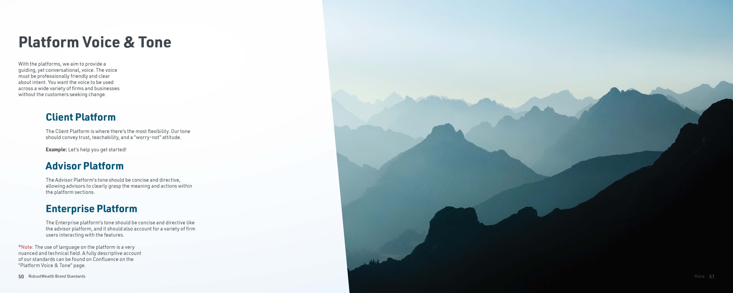
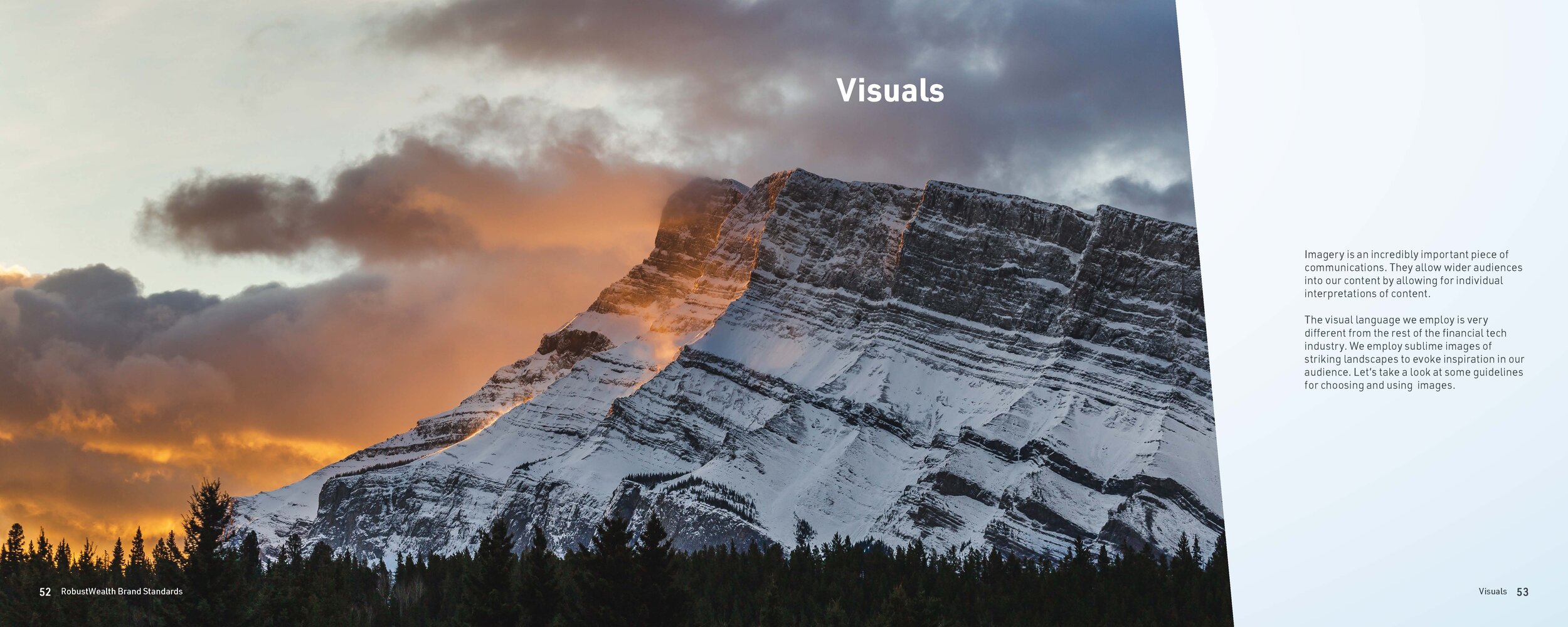
From this brand re-work, I developed an entire brand standards document detailing the usage of these elements as well as color, type, language, and imagery in service of communicating with a strong and unified tone.


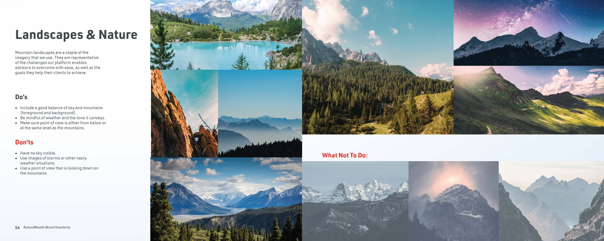
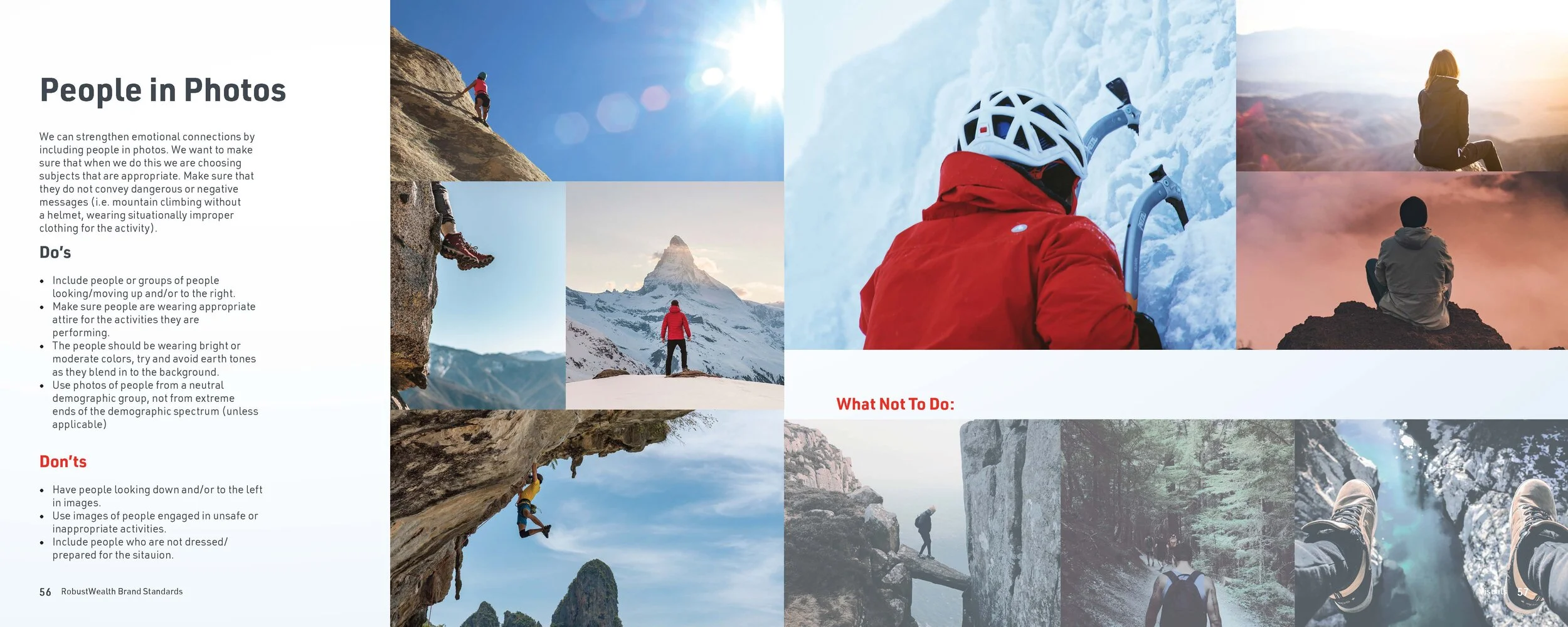
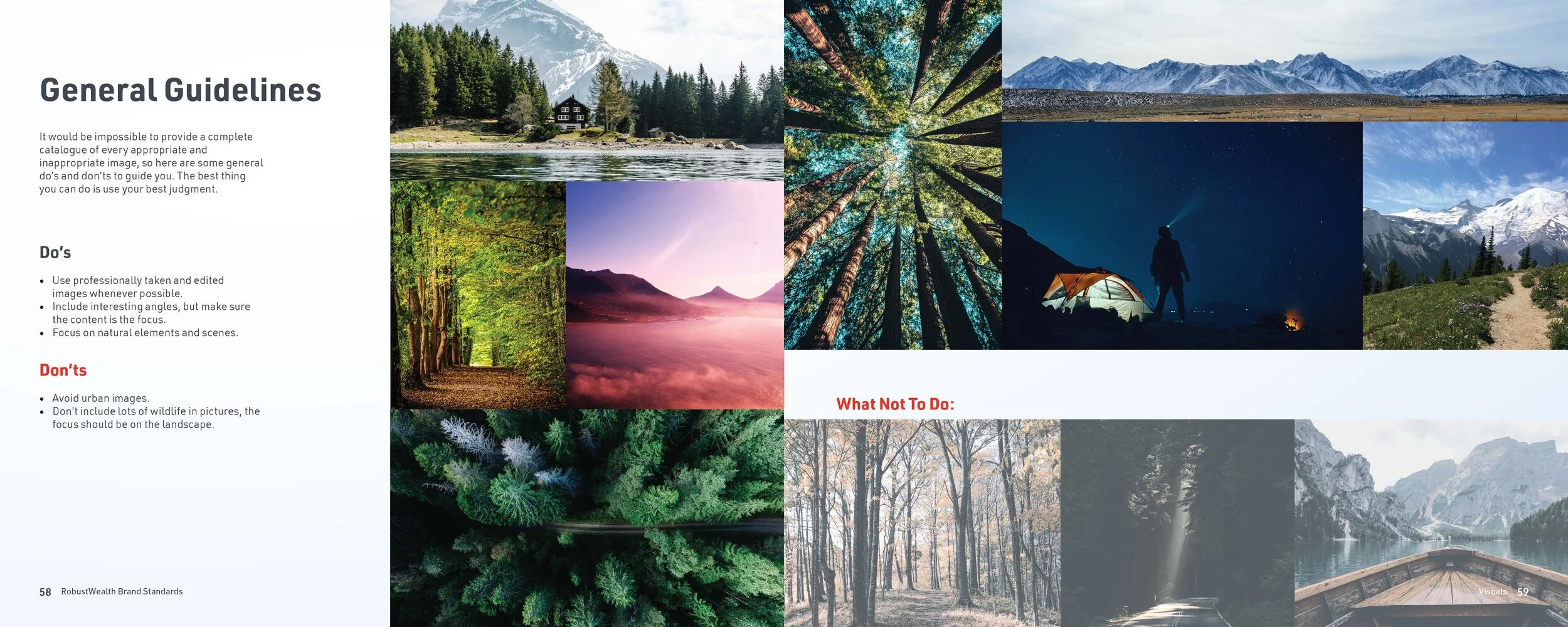
Throughout the rest of my time with RobustWealth I supported both the Client Platform, Design, and Marketing teams in many capacities. Here is a small sample of some of the other work I performed in this role.
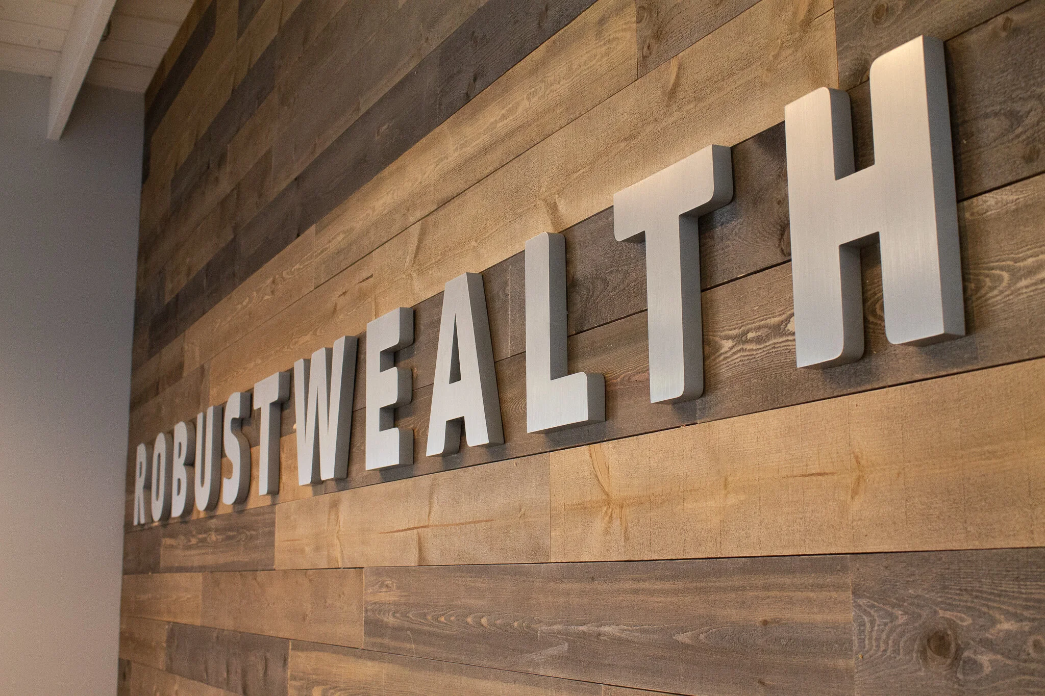
PLACEMAKING & SIGNAGE

CONFERENCE GRAPHICS