Copper Mountain Scan Challenge
Get out. Get Laps. Get Prizes.
What do you do when you are one mountain resort competing for scans with other mountain resorts as part of a major pass? You incentivize! And in a time with more and more visitation incentives, you need to be able to stand out from the crowd, find your unique voice, and shout it from the mountain tops. That was the task with Copper Mountain’s Scan Challenge project. In the end we managed to receive nearly 10,000 participants in the first year of the program, and are excited to see how it grows.
Evolution of the mark
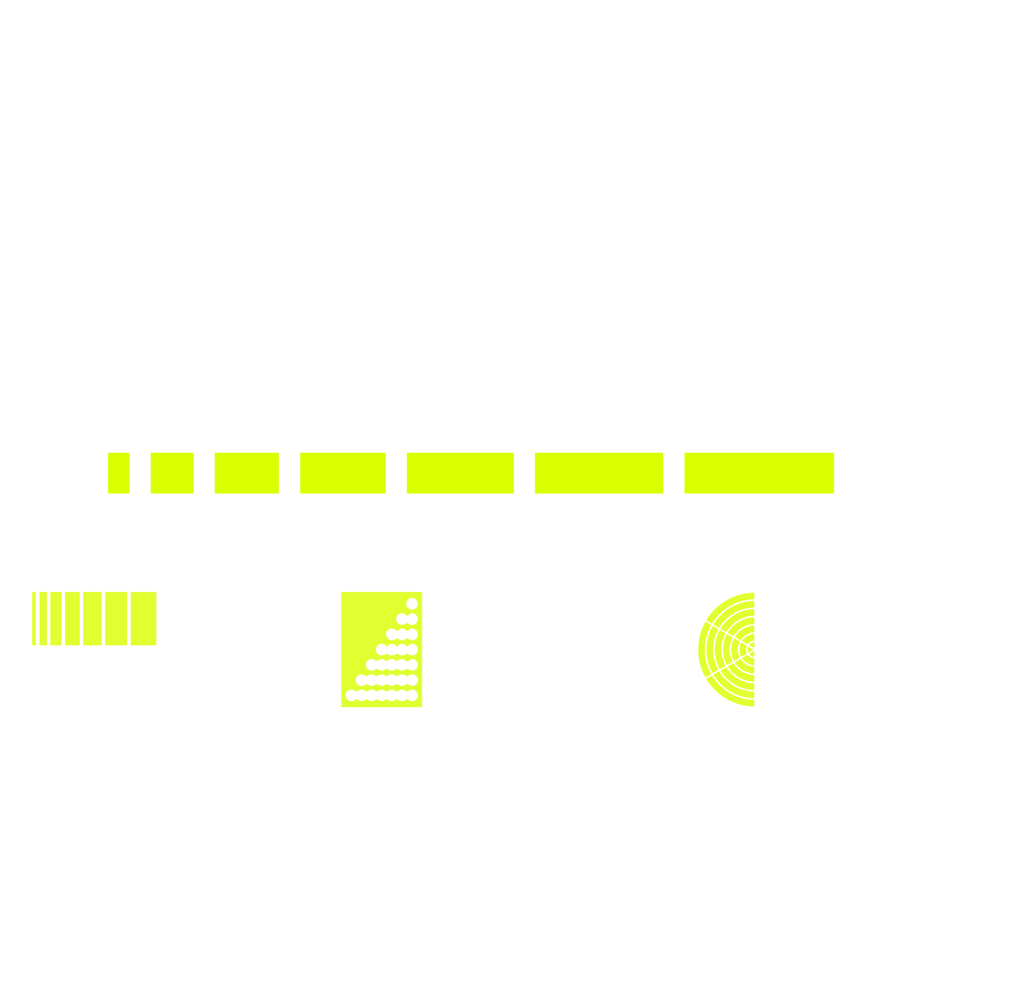
The mark for Scan Challenge experienced many forms during its development. It started with a very literal take on the scan, utilizing a polar grid similar to a sonar or radar display. Icons and monograms were also explored, but they didn’t have the punch or presence needed to establish our program as the industry lead.
One of the challenges for this mark was that it had to exist within and co-exist well with the established brand standards of Copper Mountain, That allowed for quick selection of a type face to set the word mark in.
For the development of the “speed lines” in the final mark I started with seeing how I could show a sense of growth, or rewards stacking one after the other as the guest gets more and more days on hill. I selected increments of seven as there are seven tiers of rewards a quest can win through the season. After some refinement and review with stakeholders we landed on the speed lines under the wordmark. This allowed us a combination mark that has a very usable aspect ratio and wrks well in tandem with the Copper logo.
With the intent to roll out communications to participants as they achieve the awards, I developed “engaged” versions of all of the logos to help share the stoke and encourage continued participation. These were distributed in automated email sent to participants upon completion of each tier of award.
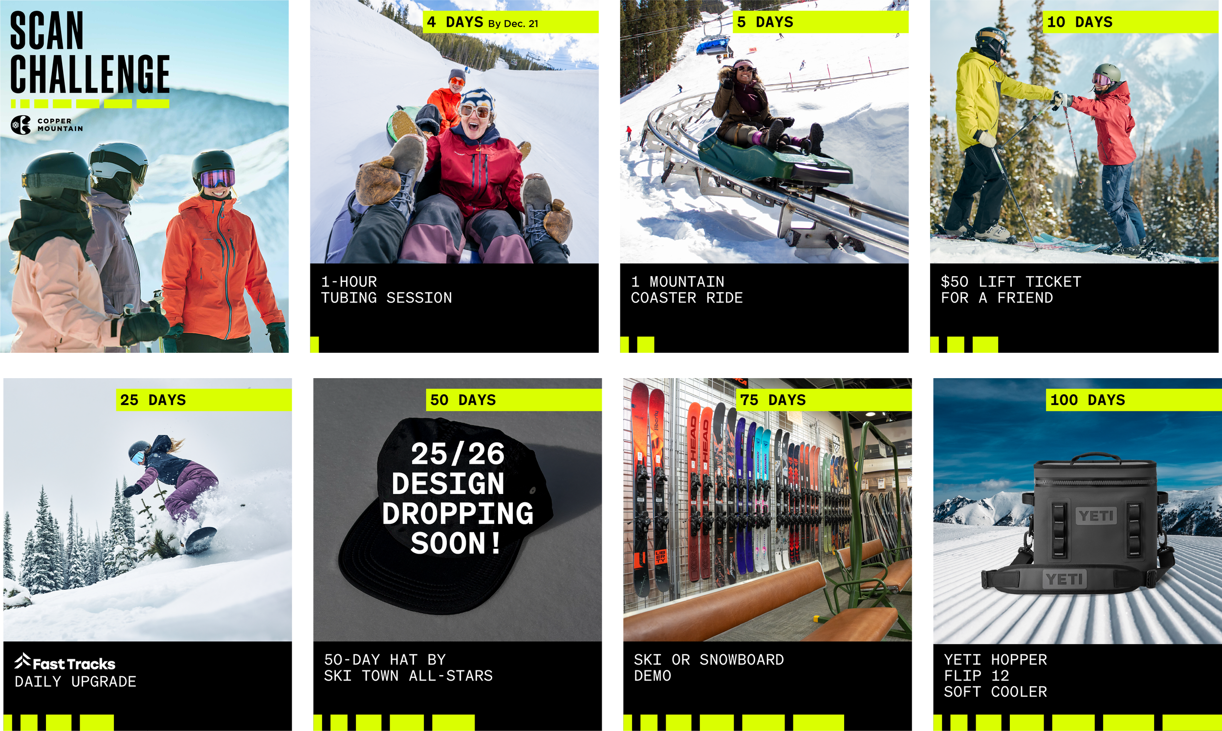
Graphics depicting the progression of prizing throughout the season were prepped for social. The “speed lines” from the identity mark were extrapolated and utilized through the carousel of posts to help convey that progression of rewards and building energy.

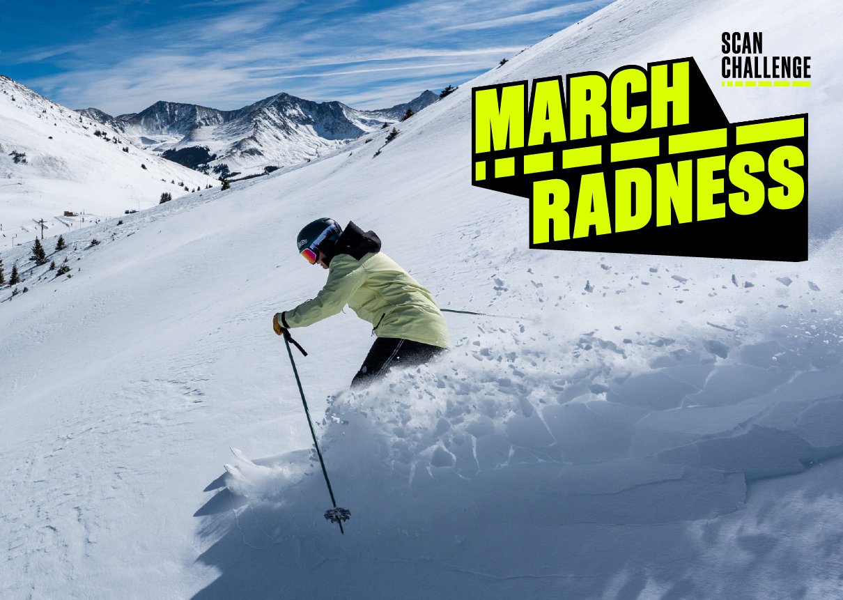
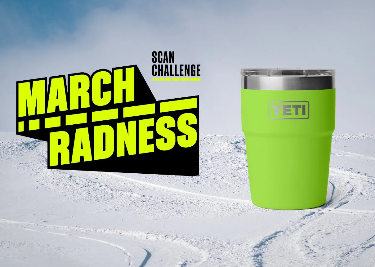
The program received a handful of one-off extra promotions throughout the season, with the most successful being the “March Radness” campaign. If participants rode 5 days in March they’d receive the pictured Yeti tumbler. I had the opportunity to spin up a mark for this campaign, and was the perfect time to emulate the “March Madness” logo. I was able to utilize an on-brand typeface and place the “speed lines” in the center as a divider to further tie the program to the promotion. This campaign was a major success and we cleared out our stock of nearly 500 Yetis during one of the worst snowpack seasons on record.